
Retail Wealth App
Designing a unified banking and investment experience

Project Overview
This project focused on redesigning the banking experience by combining retail and wealth into one app. The goal was to remove friction and help users manage their finances in one place instead of switching between platforms.
Design Question?
How might we create a unified app experience that allows users to manage their everyday banking and investments seamlessly in one place?

Problem Statement
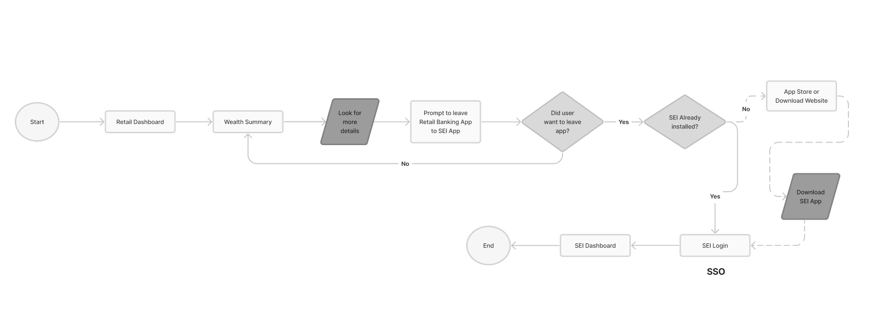
Users had to switch between separate apps to manage banking and investments, which created confusion, reduced engagement with wealth features, and made it hard to understand their full financial picture.

I analyzed the existing retail and wealth app experiences to understand how users currently navigate between platforms and where friction occurs in cross-platform journeys. I also conducted discussions with stakeholders to better understand business constraints, priorities, and technical considerations. In parallel, I reviewed competitor apps to benchmark how integrated financial experiences are designed and identify opportunities for improvement.
The goal of this project was to improve the overall user experience by creating a more seamless and intuitive journey, while increasing engagement with wealth products. A key focus was reducing drop-off between platforms by eliminating friction points and ensuring a smooth transition between banking and investment tasks. Additionally, the experience needed to support both new and experienced users by balancing simplicity with functionality.
My Role
I led the UX design from research to solution, including flows, wireframes, and prototypes, while working closely with product and engineering to align on feasibility and requirements.
Research Approach
Goals

Current State
Opportunity
Bring banking + investments into one place
Make wealth features easier to discover
Simplify financial data
Create smoother navigation
Key Insights
Users want a single view of their finances
Switching apps creates friction
Wealth tools are underused because they’re hard to access
Simplicity is critical for adoption
Chose a unified dashboard to reduce switching
Used progressive disclosure to avoid overwhelming users
Prioritized high-frequency tasks on the main screen
Balanced business goals (wealth engagement) with usability
Design Decisions
Impact
Improved visibility of wealth products
Reduced friction between user journeys
Created a scalable direction for future development
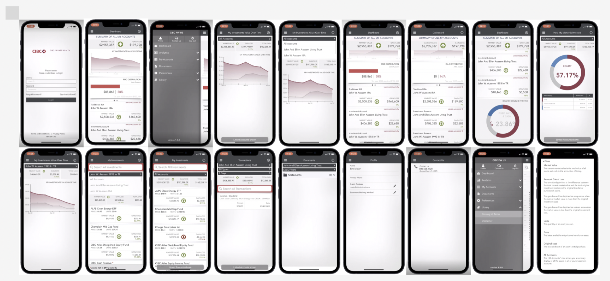
Current State Mobile Screens
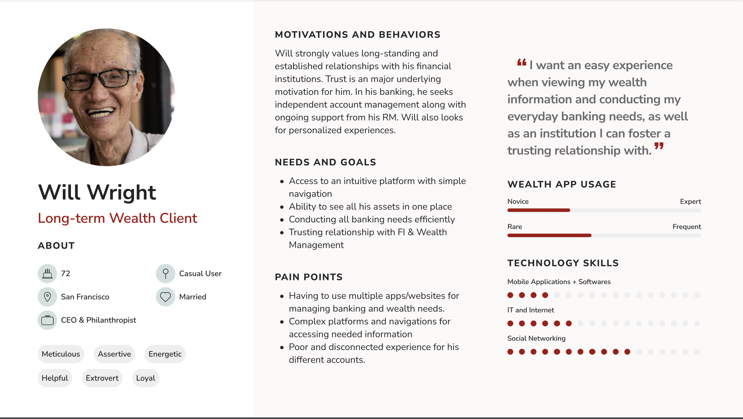
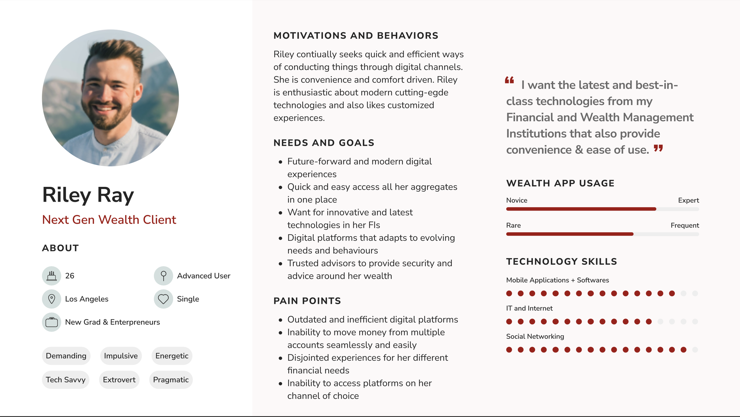
User Persona
Trade-offs
Couldn’t show all financial data at once → simplified views
Had to balance depth vs simplicity
Some features were phased into future roadmap due to constrain
Validation
Internal stakeholder reviews
Prototype walkthroughs
Iterative feedback cycle
Solution
View banking + investments together
Navigate easily between tasks
Understand their financial health clearly
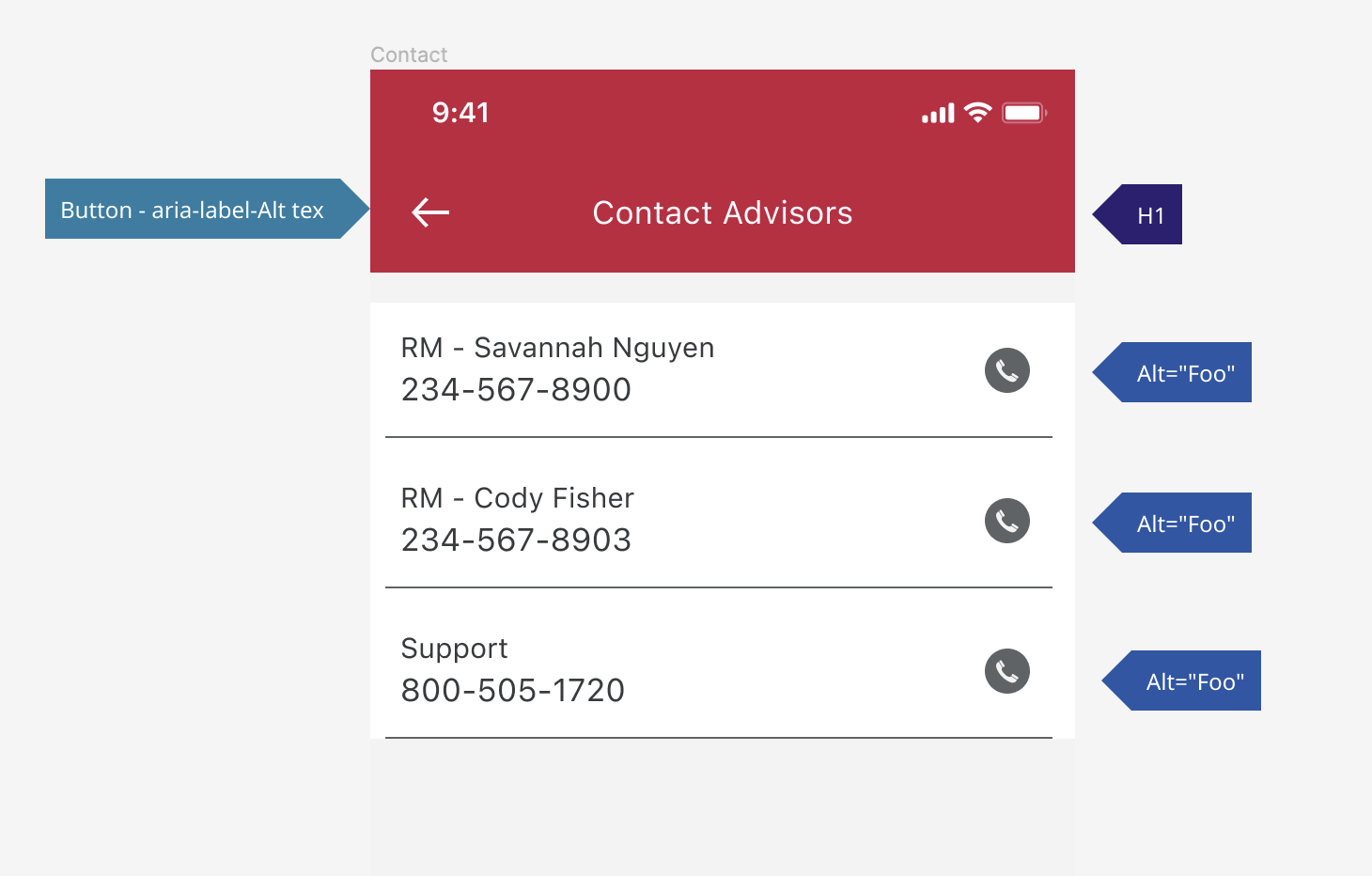
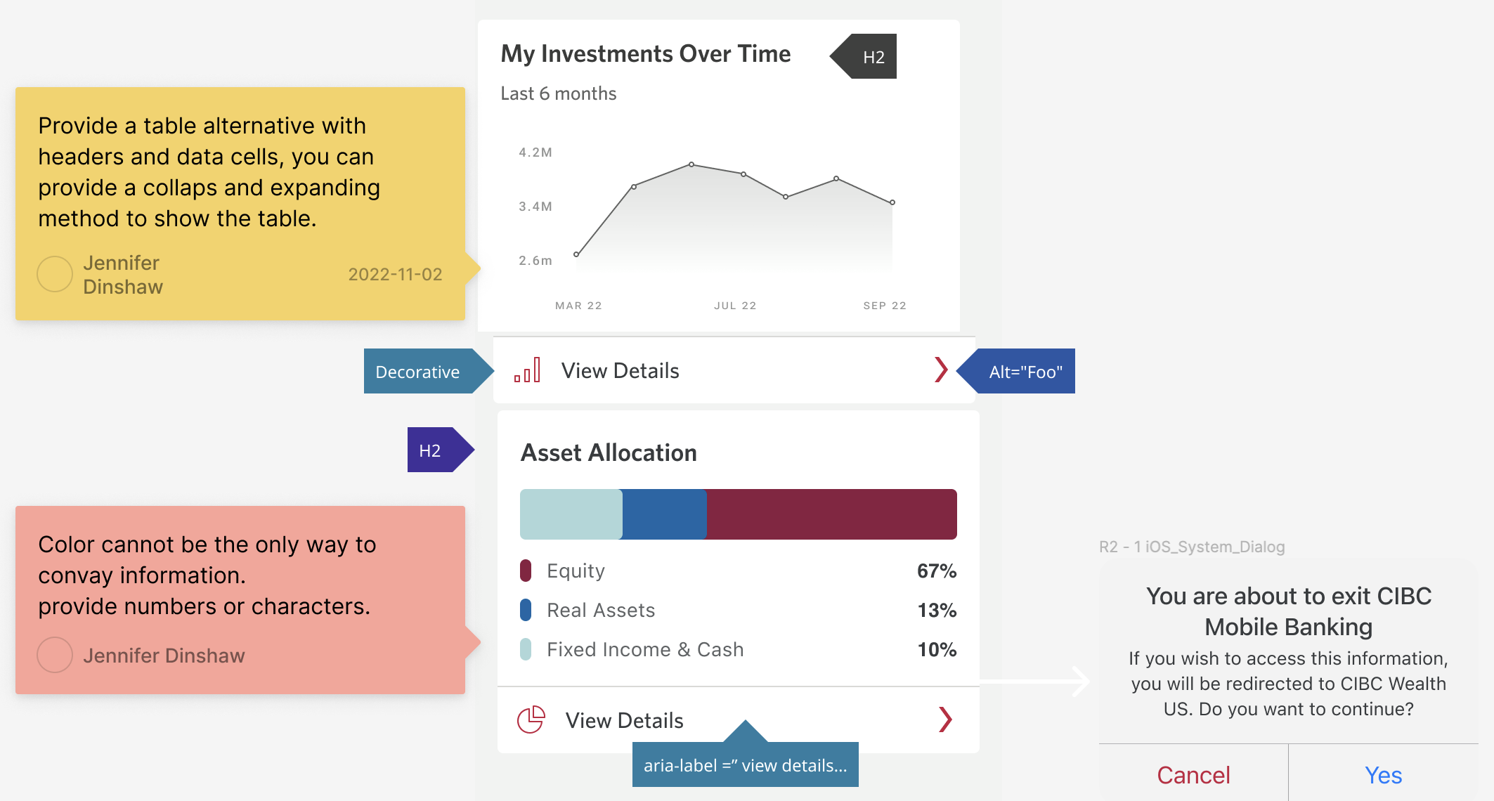
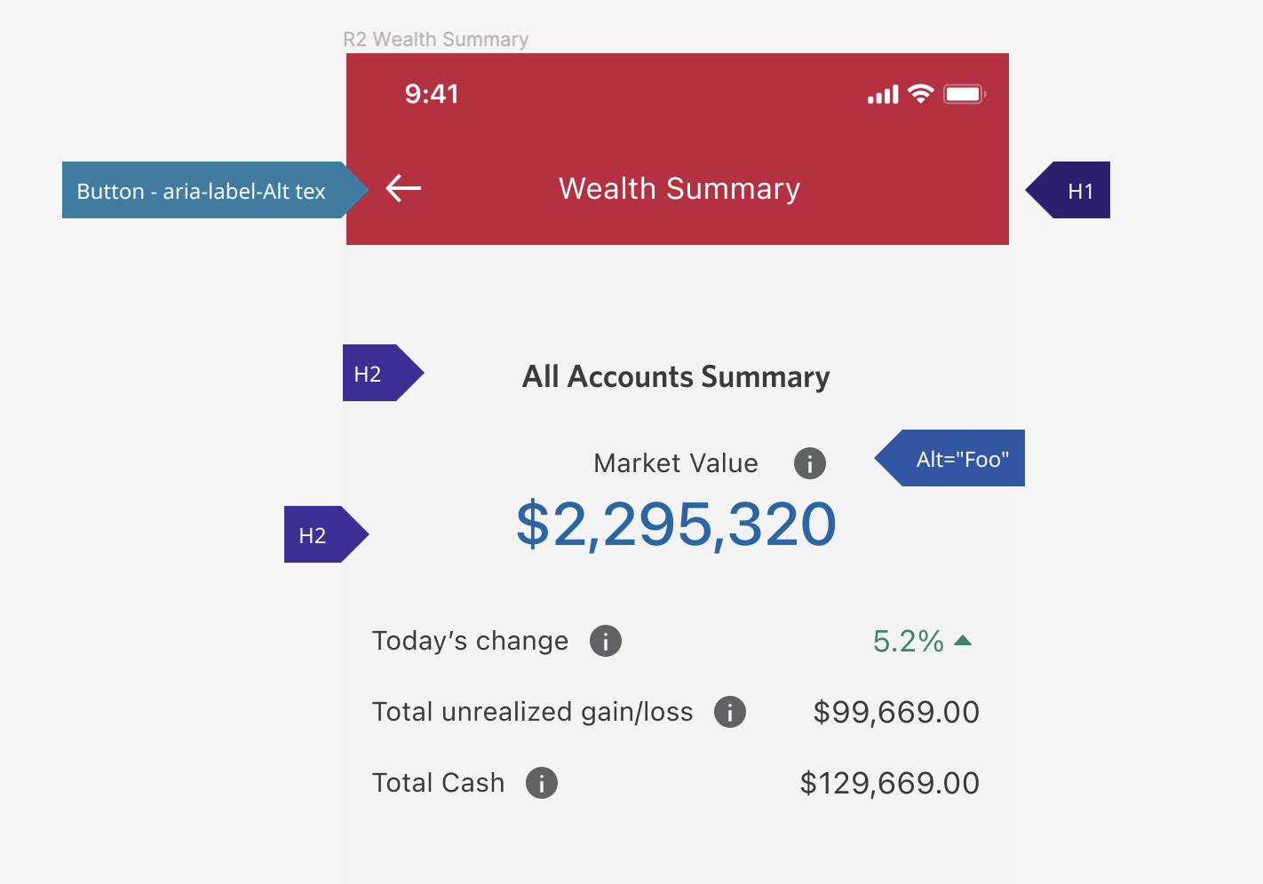
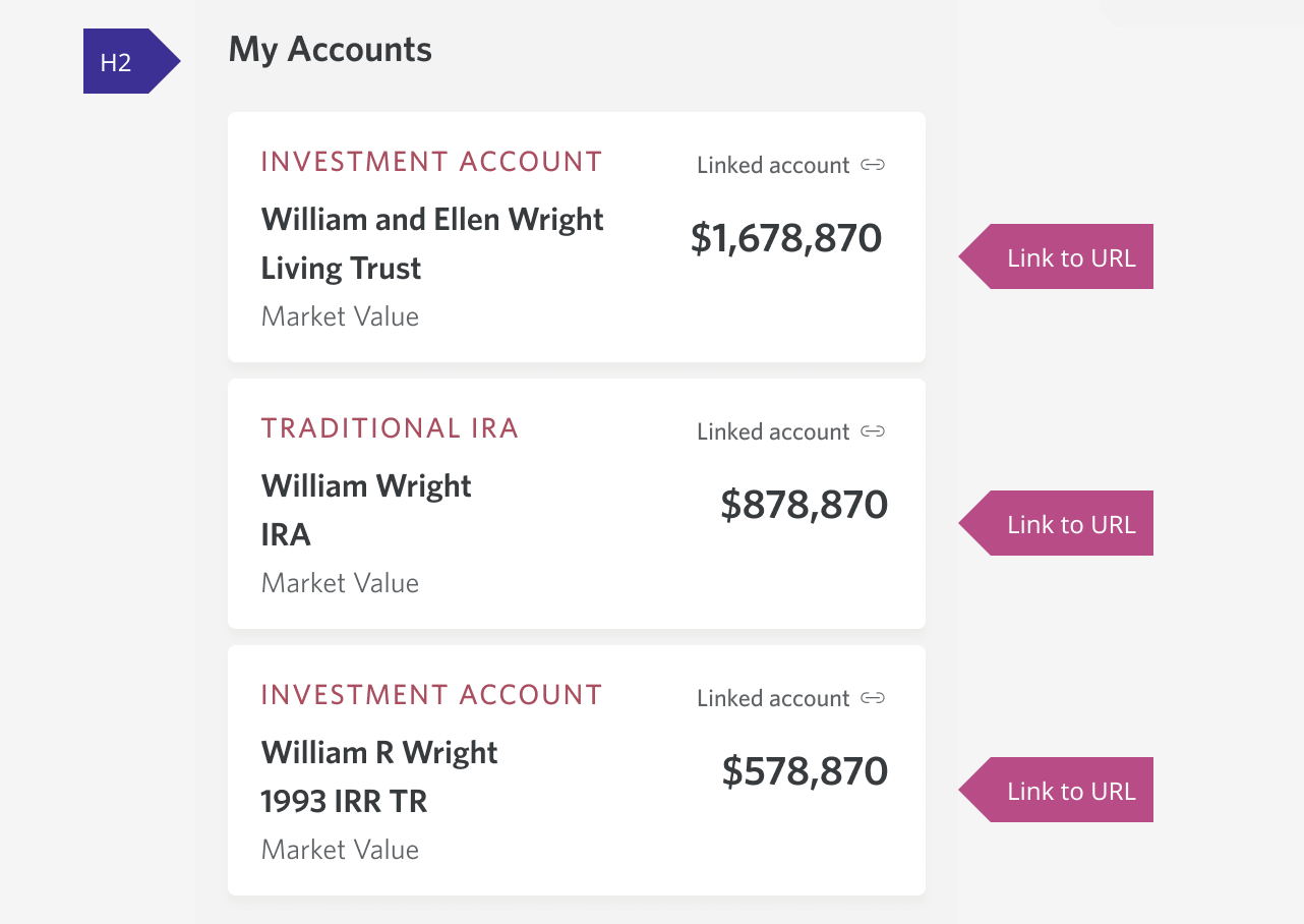
Accessibility Considerations
Accessibility was a key consideration throughout the design process to ensure the experience is inclusive for a diverse range of users, including older demographics and users with varying levels of financial literacy. I focused on maintaining strong color contrast, clear typography, and intuitive navigation patterns to improve readability and usability. Complex financial information was simplified using progressive disclosure to avoid cognitive overload, while ensuring that critical information remained easy to access. The design also supports screen reader compatibility and follows accessibility best practices to create a more inclusive and user-friendly experience for all users.

Mobile Screens and Virtual Assistant
Worked with product, engineering, and stakeholders to ensure the solution met both user needs and technical constraints.
Reflection
If I had more time, I would validate the solution with real users and measure improvements using engagement and usability metrics.